
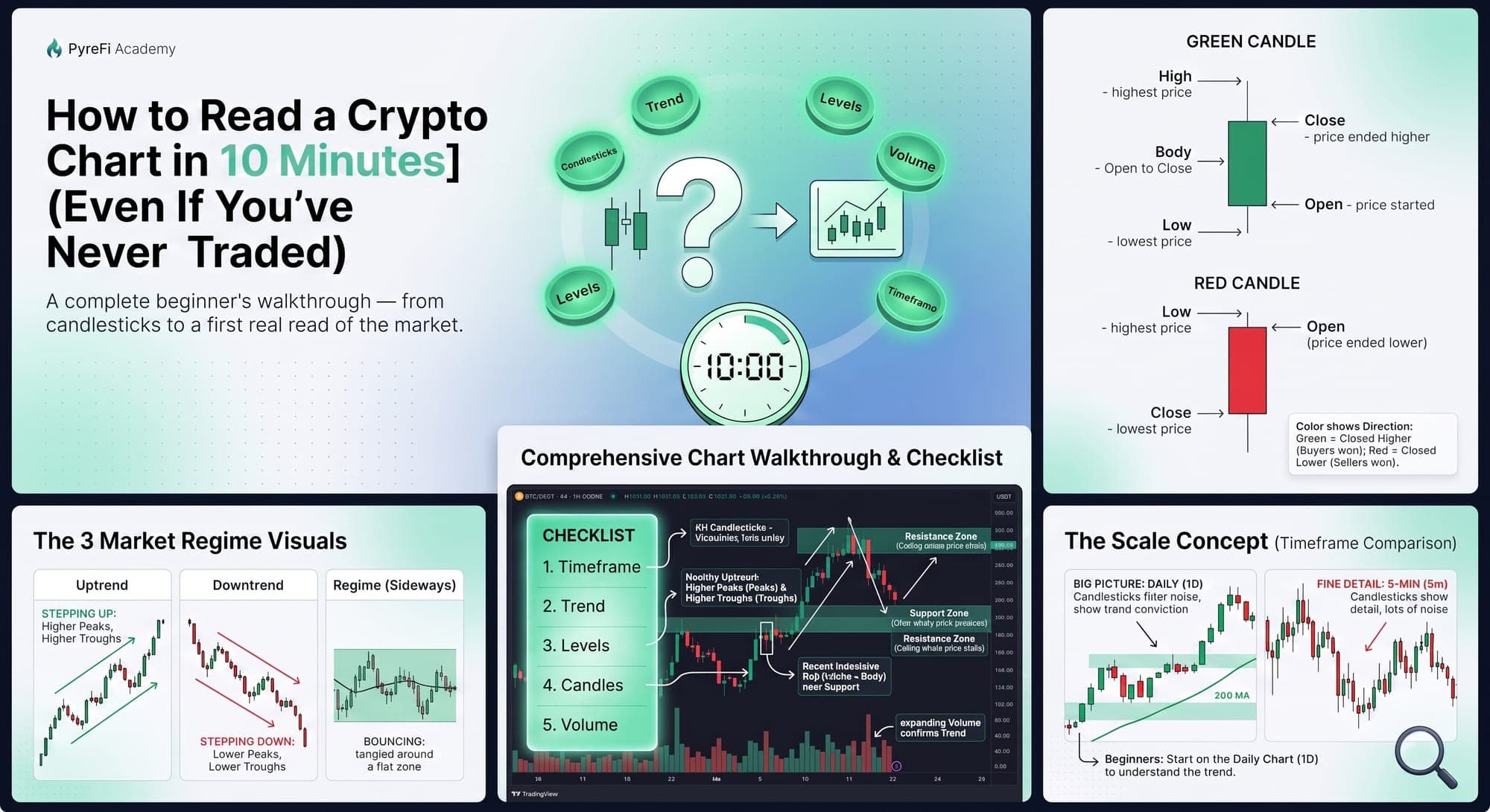
A complete beginner's walkthrough — from candlesticks to a first real read of the market.
If you've ever opened a crypto chart and felt like you were staring at the cockpit of a plane — a wall of colored bars, squiggly lines, and numbers — you're not alone. But here's the good news: the core of chart reading is genuinely simple. In the next ten minutes, you'll learn enough to look at any crypto chart and actually understand what it's telling you.
We'll build up one layer at a time. No jargon left undefined.
Step 1: Understand a single candlestick (2 minutes)
Almost every crypto chart uses candlesticks. Each candle represents price action over a set period — one minute, one hour, one day, depending on your chart's timeframe. A single candle packs in four pieces of information:
- Open — the price at the start of the period.
- Close — the price at the end.
- High — the highest price reached.
- Low — the lowest price reached.
The thick part is the body, stretching from open to close. The thin lines above and below are the wicks (or shadows), reaching to the high and low.
Color tells you direction: - Green (or white) = price closed higher than it opened. Buyers won the period. - Red (or black) = price closed lower than it opened. Sellers won.
That's the entire alphabet. A green candle with a small body and long lower wick, for example, tells a story: sellers pushed price way down (the long lower wick), but buyers fought back and closed it near the top (the small green body). You just read your first candle.
Step 2: Read the trend (2 minutes)
Zoom out. Don't look at individual candles — look at the overall direction. There are only three possibilities:
- Uptrend: price is generally making higher peaks and higher troughs, stepping up and to the right.
- Downtrend: lower peaks and lower troughs, stepping down.
- Sideways (range): price bounces between a rough ceiling and floor, going nowhere overall.
This is the single most important read you'll make, because everything else depends on it. A strategy that works in a trend fails in a range, and vice versa. Before you notice anything else, answer: up, down, or sideways?
A quick shortcut: add a moving average (a line that smooths out price). If price is mostly above a rising line, you're in an uptrend. Below a falling line, a downtrend. Tangled around a flat line, a range.
Step 3: Spot support and resistance (2 minutes)
Now look for the levels where price keeps reacting.
- Support is a price area where falling price tends to stop and bounce — a "floor" where buyers step in.
- Resistance is an area where rising price tends to stall and reverse — a "ceiling" where sellers step in.
You'll spot them by looking for horizontal areas the chart has touched multiple times and turned away from. Draw them as zones (shaded bands), not precise lines — price respects regions, not exact numbers.
These levels matter because they're where the action happens. Price breaking above resistance or below support is often a meaningful event. Price approaching a level tells you a decision point is coming.
Step 4: Check the volume (1 minute)
Below the price, most charts show volume bars — how much was traded in each period. The rule is simple: volume shows conviction.
- A big price move on high volume = lots of participation, more trustworthy.
- A big price move on low volume = few participants, more likely to be a head-fake.
When something dramatic happens on the chart, glance at volume. Did a lot of people participate, or just a few? That one check will save you from chasing a lot of fake moves.
Step 5: Choose the right timeframe (1 minute)
Every chart has a timeframe setting — the period each candle represents. This dramatically changes what you see:
- Higher timeframes (daily, weekly) show the big picture and are less noisy. Best for understanding the overall trend.
- Lower timeframes (5-minute, 1-hour) show fine detail and lots of noise. Used for precise timing.
For a beginner, start on the daily chart. It filters out the frantic noise and shows you the trend that actually matters. Only drop to lower timeframes once you understand the big picture — otherwise the noise will whipsaw your judgment.
Step 6: Put it together — a first real read (2 minutes)
Now combine the layers. Here's the checklist to run on any chart:
- Timeframe: Set it to daily to start.
- Trend: Higher highs/lows (up), lower highs/lows (down), or sideways?
- Levels: Where are the obvious support and resistance zones? Where is price now relative to them?
- Candles: What's the most recent price action saying? Strong bodies or indecisive wicks?
- Volume: Is recent action backed by participation, or fading?
Run through those five and you can form a genuine read: "This asset is in an uptrend on the daily, currently pulling back toward a support zone, on declining volume — so buyers may step in near support, but I'd want to see volume confirm before trusting a bounce." That's a real analysis. You just did it.
What not to do as a beginner
- Don't add a dozen indicators. They'll overwhelm you and mostly repeat each other. Master price, trend, levels, and volume first.
- Don't zoom into 1-minute charts and panic. The noise there is meaningless for beginners and will exhaust you emotionally.
- Don't confuse a chart with a crystal ball. Charts show probabilities and context, not certainties. No pattern "guarantees" anything.
- Don't trade based on a single candle. Context — trend, levels, volume — matters far more than any one bar.
Why this scales into something bigger
What you just learned is the foundation everything else is built on. Professional traders and automated systems are, at their core, doing a more rigorous version of these same steps — identifying trend, mapping levels, weighing volume — just across hundreds of assets at once and with far more data layered on top (derivatives, on-chain flows, order-flow analysis). But the mental model is the same one you now hold. When you eventually encounter advanced tools or trading signals, you'll understand what they're actually reasoning about, because it starts here.
The takeaway
Reading a crypto chart isn't a mystical skill reserved for pros. It's five simple layers stacked together: candles show price action, trend shows direction, support and resistance show the levels that matter, volume shows conviction, and timeframe sets your zoom. Learn those, run the checklist, and you can look at any chart and actually understand the story it's telling.
You won't be a master in ten minutes — nobody is. But you'll never look at a chart as a wall of noise again. And that's the real beginning.
PyreFi does this reasoning — trend, levels, volume, and much more — across the entire tradable crypto market continuously, so beginners can start from a clear read instead of a wall of noise.