
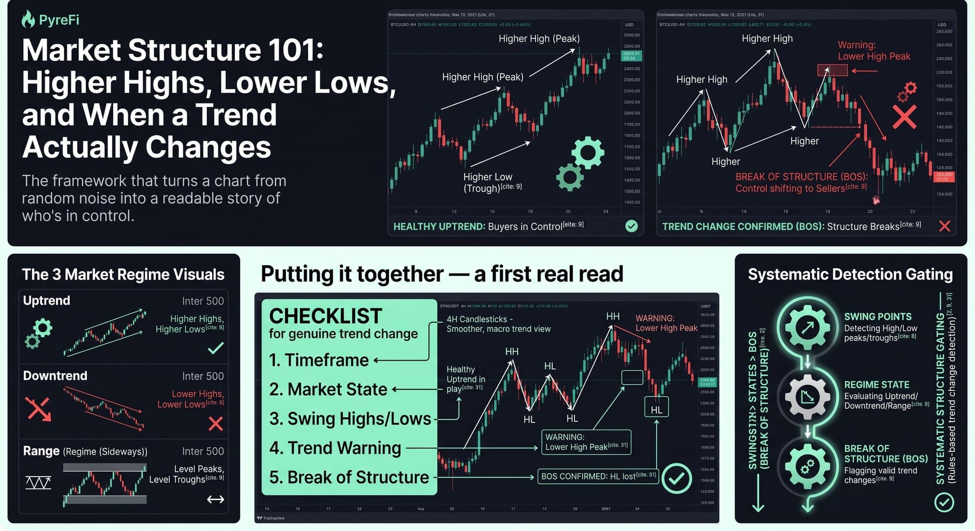
The framework that turns a chart from random noise into a readable story of who's in control.
Before indicators, before patterns, before any of the tools traders love to argue about, there's something more fundamental: market structure. It's the skeleton underneath every chart — the framework that tells you whether buyers or sellers are in control, and, crucially, when that control changes hands.
If you learn only one analytical concept, make it this one. Market structure is the difference between seeing a chart as random noise and reading it as a coherent story. Here's the whole framework, built from the ground up.
The building blocks: swing highs and swing lows
Everything starts with two simple points:
- A swing high is a peak — a candle whose high is higher than the candles on either side. It marks a point where buyers ran out of steam and sellers pushed back.
- A swing low is a trough — a candle whose low is lower than its neighbors. It marks where sellers exhausted and buyers stepped in.
That's it. Zoom out on any chart and you'll see a sequence of these peaks and troughs. The relationship between them is market structure.
The three states of a market
By reading the sequence of swing highs and lows, every market resolves into one of three states.
1. Uptrend: higher highs and higher lows. Each peak is higher than the last (higher highs), and each trough is higher than the last (higher lows). This stair-stepping upward is the definition of an uptrend. It tells you buyers are in control — every dip gets bought at a higher level than before, and every rally pushes further. As long as this pattern holds, the trend is intact and you should favor the long side.
2. Downtrend: lower highs and lower lows. The mirror image. Each peak is lower than the last, each trough lower than the last. Sellers are in control — every bounce gets sold at a lower level, every decline extends. Favor the short side (or stay out) while this pattern holds.
3. Range: no clear progression. Peaks and troughs are roughly level — price oscillates between a ceiling and a floor without net progress. Neither side is decisively in control. Ranges call for a completely different approach (fading the edges) than trends (riding the direction).
Simply identifying which of these three states you're in — before doing anything else — instantly makes you a better trader, because it stops you from applying trend logic to a range or range logic to a trend.
The crucial concept: break of structure
Here's where market structure becomes powerful for actually anticipating change. A trend doesn't reverse randomly — it reverses when the structure breaks. This is called a break of structure (BOS) or a change of character (CHoCH).
Consider an uptrend: higher highs, higher lows, stair-stepping up. The trend is healthy as long as that pattern continues. The first warning comes when price fails to make a new higher high — it rallies but stalls below the previous peak. That's a lower high, a crack in the pattern.
The confirmation comes when price then breaks below the most recent higher low. That break says the buyers who had been defending each dip at a higher level have failed. The structure of higher highs and higher lows is now broken. Control may be shifting to the sellers.
This is the moment a trend actually changes — not when an indicator flashes, not when a headline drops, but when the structure itself breaks. A confirmed break of structure is one of the earliest and most reliable signs of a genuine trend change, because it's based on the raw mechanics of who's winning at the levels that matter.
Reading the story
Once you internalize this, a chart transforms into a narrative:
- "Price has been making higher highs and higher lows — buyers in control, uptrend intact."
- "But the last rally made a lower high — the first sign buyers are weakening."
- "Now price has broken below the prior higher low — structure is broken, control is shifting to sellers."
- "If price now starts making lower highs and lower lows, the downtrend is confirmed."
That's a complete, evidence-based read of a market in transition — and you built it entirely from peaks and troughs, no fancy tools required. This is the foundation that everything else (support/resistance, patterns, indicators) hangs on.
Structure and support/resistance work together
Market structure and support/resistance zones are deeply connected. Swing highs and swing lows are the levels that become support and resistance. A previous swing high, once broken, often becomes support on the retest. A previous swing low, once lost, often becomes resistance. Reading structure and marking zones are two halves of the same skill: identifying the meaningful turning points and understanding how price relates to them.
Multi-timeframe structure
Structure exists on every timeframe, and they can disagree — which is a feature, not a contradiction. The daily might be in a clear uptrend while the 1-hour is in a short-term downtrend (a pullback). Understanding this resolves a lot of confusion:
- The higher-timeframe structure sets your dominant bias.
- The lower-timeframe structure shows the shorter-term swings within it.
A pullback in an uptrend is simply a lower-timeframe downtrend inside a higher-timeframe uptrend. When the lower-timeframe structure breaks back to the upside (resuming higher highs and higher lows), that's often a high-probability signal that the pullback is over and the dominant uptrend is resuming — one of the cleanest entries in trading.
Common mistakes
Calling a reversal too early. A single lower high is a warning, not a reversal. Wait for the confirming break of structure. Jumping the gun leads to fighting trends that are merely pausing.
Ignoring the higher timeframe. A break of structure on the 5-minute is trivial noise if the daily trend is powerfully intact. Always weight higher-timeframe structure more heavily.
Forcing structure where there's a range. Not every market is trending. If peaks and troughs are level, respect that it's a range and stop hunting for a trend that isn't there.
Why structure scales
The beauty of market structure is that it's rules-based — it's about objective relationships between identifiable points, not subjective feelings about a chart. That makes it something systematic approaches can evaluate rigorously and consistently across many assets at once. An automated system can track swing highs and lows, identify the current state, and flag breaks of structure across the entire market without the emotional bias that leads human traders to see reversals where there are none (or miss them where they are). The framework you apply by eye on one chart is the same one that scales to watching everything.
The takeaway
Market structure is the skeleton beneath every chart. Read the sequence of higher highs, higher lows, lower highs, and lower lows, and you instantly know which of three states you're in — uptrend, downtrend, or range — and therefore how to trade it. Watch for the break of structure: the moment the pattern fails is the moment control changes hands, and it's one of the earliest reliable signs of a genuine trend change.
Master this before anything else. Indicators come and go, patterns fail and succeed, but structure is the honest, foundational story of the market — the answer to the only question that ultimately matters: who's in control, and are they losing their grip?
PyreFi tracks market structure — swings, states, and breaks of structure — systematically across every token, so control shifts get flagged by rules, not by hunches.