
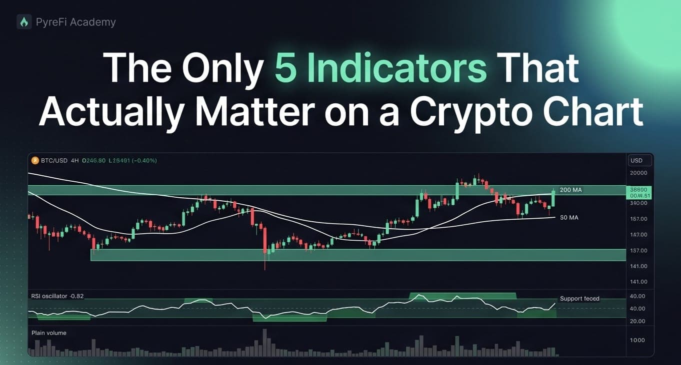
Delete the other forty. Here's the minimal toolkit that covers trend, momentum, volatility, volume, and structure.
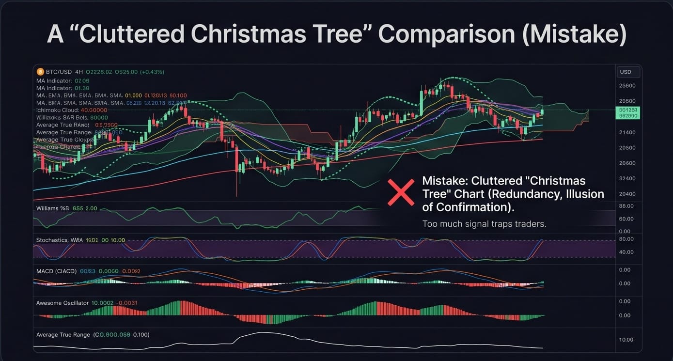
Open the indicator menu on any charting platform and you'll find hundreds of options. Traders, especially new ones, respond to this abundance by stacking a dozen indicators on a single chart until it looks like a Christmas tree — a tangle of colored lines that, collectively, say nothing.
Here's the uncomfortable truth: most indicators are variations on the same handful of ideas. They measure the same things with different math and prettier lines. You don't need forty. You need five — one for each dimension of price action that actually matters. Master these, delete the rest, and your charts (and decisions) get dramatically clearer.
The principle: one indicator per dimension
Price action has a small number of independent dimensions:
- Trend — which way is it going, and how strongly?
- Momentum — is the move accelerating or fading?
- Volatility — how much is it moving, and is that expanding or contracting?
- Volume — is there real participation behind the move?
- Structure — where are the levels that matter?
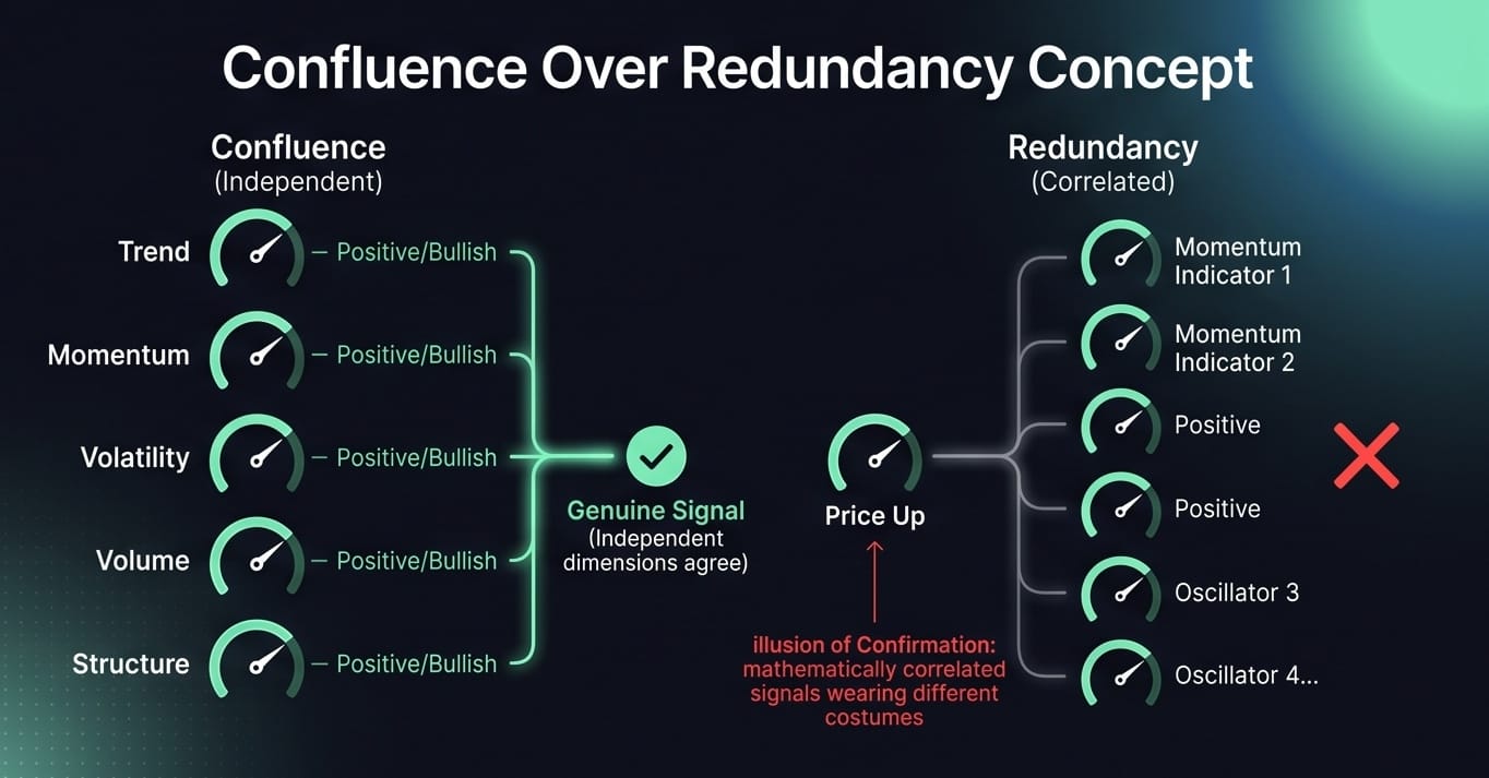
Stacking three momentum oscillators doesn't give you three signals; it gives you one signal, tripled, with false confidence. The goal is coverage of independent dimensions, not redundancy. Here's the minimal set.
1. Moving averages (trend)
A moving average smooths price into a single line that shows direction. The two most useful configurations:
- The 200-period MA on the daily is the market's line in the sand between long-term bullish and bearish. Price above it, buyers are in control; below, sellers are. Simple, and widely watched — which is part of why it works.
- A shorter MA (like the 20 or 50) shows the medium-term trend and often acts as dynamic support in an uptrend or resistance in a downtrend.
Watch how price interacts with these lines and how the lines are sloped. You don't need five moving averages. Two — one long, one medium — cover trend completely.
2. RSI (momentum)
The Relative Strength Index measures the speed and strength of price moves. Its real value isn't the "overbought/oversold" labels most people misuse — it's divergence (price making a new high while momentum makes a lower high signals a weakening move) and where it finds support and resistance within its own range. One momentum oscillator is enough. If you have RSI, you don't also need Stochastics and MACD's histogram and the Awesome Oscillator — they're all telling you a version of the same story.
3. Bollinger Bands or ATR (volatility)
Volatility is the dimension most beginners ignore, and it's crucial for both entries and stops.
- Bollinger Bands plot standard-deviation channels around a moving average. When the bands squeeze tight, volatility is contracting — often the calm before a large move. When they expand, volatility is high.
- ATR (Average True Range) gives you volatility as a single number, which is invaluable for sizing stops: a stop placed at 1.5× ATR is adaptive to the asset's actual behavior instead of an arbitrary percentage.
Pick one. Bollinger Bands if you like a visual channel; ATR if you want a number for risk math.
4. Volume (participation)
Volume is the truth serum of technical analysis. A breakout on high volume has conviction behind it; a breakout on low volume is often a trap. A rally on declining volume is running out of buyers. Volume confirms — or contradicts — everything the price is telling you.
Plain volume bars are enough for most traders. If you want more nuance, volume-based tools like VWAP (Volume-Weighted Average Price) show the average price weighted by where the volume actually traded, which institutions watch closely. But start with raw volume bars and the single habit of asking, on every important candle: did volume confirm this move?
5. Support and resistance zones (structure)
This isn't an indicator you add from a menu — it's the levels you draw, and it's arguably the most important item on this list. Everything else is context; structure is where you actually act. Mark the areas (zones, not lines) where price has repeatedly reversed. Your entries, stops, and targets should all reference this structure. Indicators tell you how price is behaving; structure tells you where it matters.
Why five is the magic number
The reason the Christmas-tree approach fails isn't that the extra indicators are "bad." It's that they create the illusion of confirmation. When you have eight momentum indicators and six of them agree, it feels like strong evidence. But they agree because they're built from the same input — they're mathematically correlated. It's one opinion wearing eight costumes.
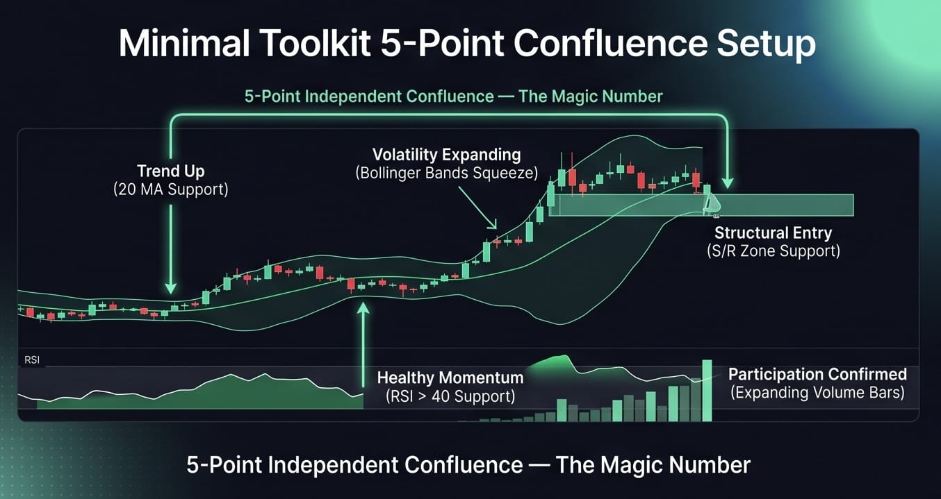
Real confirmation comes from independent dimensions agreeing: trend up, momentum healthy, volume expanding, price reacting off a structural zone, volatility breaking out of a squeeze. When those five different things line up, you have genuine confluence — several independent measurements pointing the same way. That's a signal worth trading.
This is also why professional and algorithmic approaches emphasize combining orthogonal signals rather than piling on more of the same. A system that watches trend, momentum, volatility, volume, and structure — each measuring something the others don't — extracts far more reliable information than one running twenty correlated oscillators.
Building your clean chart
Here's a practical setup:
- Base layer: candlesticks + volume bars.
- Trend: 200 MA and 50 MA (or 20 MA) on the daily.
- Momentum: RSI in a sub-panel, watched mainly for divergence.
- Volatility: Bollinger Bands on the price, or ATR in a sub-panel for stop sizing.
- Structure: your hand-drawn support/resistance zones on the higher timeframes.
That's a complete analytical toolkit. It fits on one screen without clutter, and every element earns its place by covering a dimension nothing else does.
The discipline of deletion
The hardest part of this isn't learning five indicators — it's deleting the other thirty-five you've grown attached to. There's a psychological comfort in complexity; a busy chart feels sophisticated. But complexity is not the same as insight. The most consistently profitable traders tend to have the simplest charts, because they've learned that clarity beats coverage.
If you're staring at a chart and can't decide what to do, the answer is almost never "add another indicator." It's usually "remove some, and look again."
The takeaway
You don't need a wall of indicators. You need five things, one per dimension: a moving average for trend, RSI for momentum, Bollinger Bands or ATR for volatility, volume for participation, and your own support/resistance zones for structure. Everything else is redundancy dressed up as insight.
Clean your chart down to these five. Learn to read how they interact. And when they independently agree, act with confidence — because that agreement, unlike a pile of correlated oscillators, actually means something.
PyreFi's engine combines independent signals — trend, momentum, volume, derivatives, and structure — across the whole market, applying the same "confluence over redundancy" principle to hundreds of tokens at once.